Feel Harmony Floating Hotel
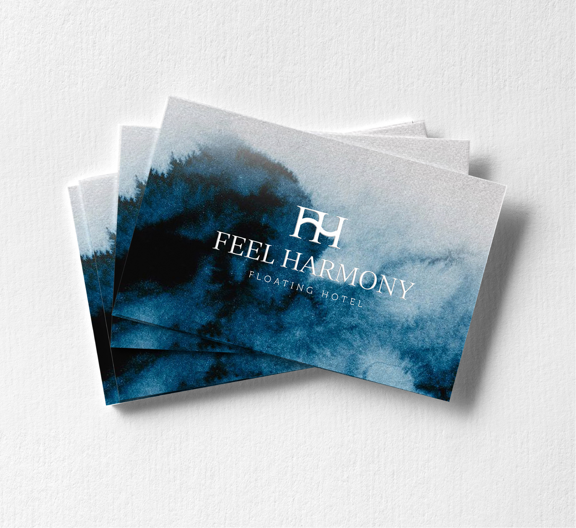
FeelHarmony Floating Hotel***** is a property created for premium customers looking for unusual solutions and unique experiences. It is a luxurious, classy hotel, offering its guests not only an extraordinary location, but also a one of a kind atmosphere.
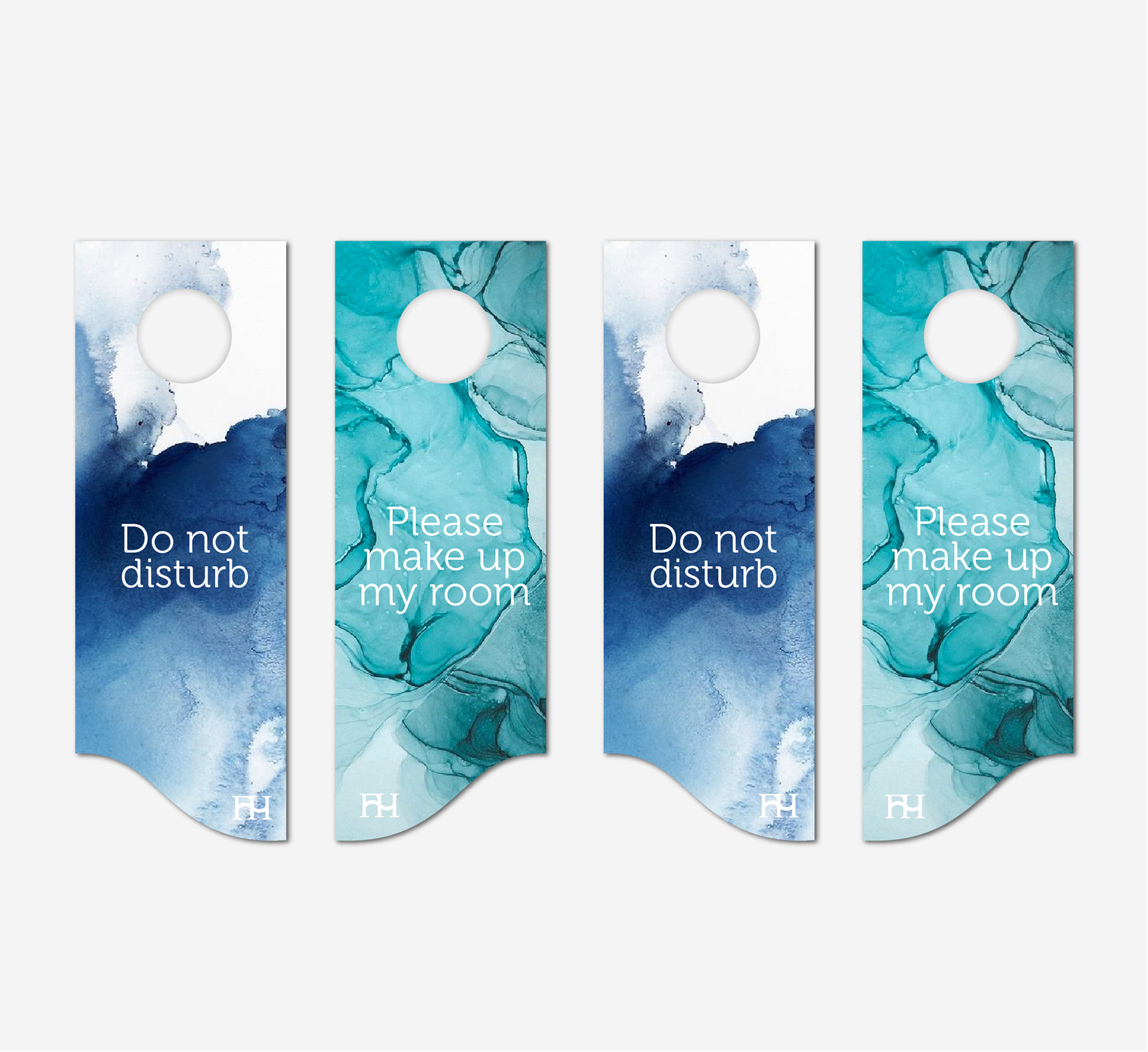
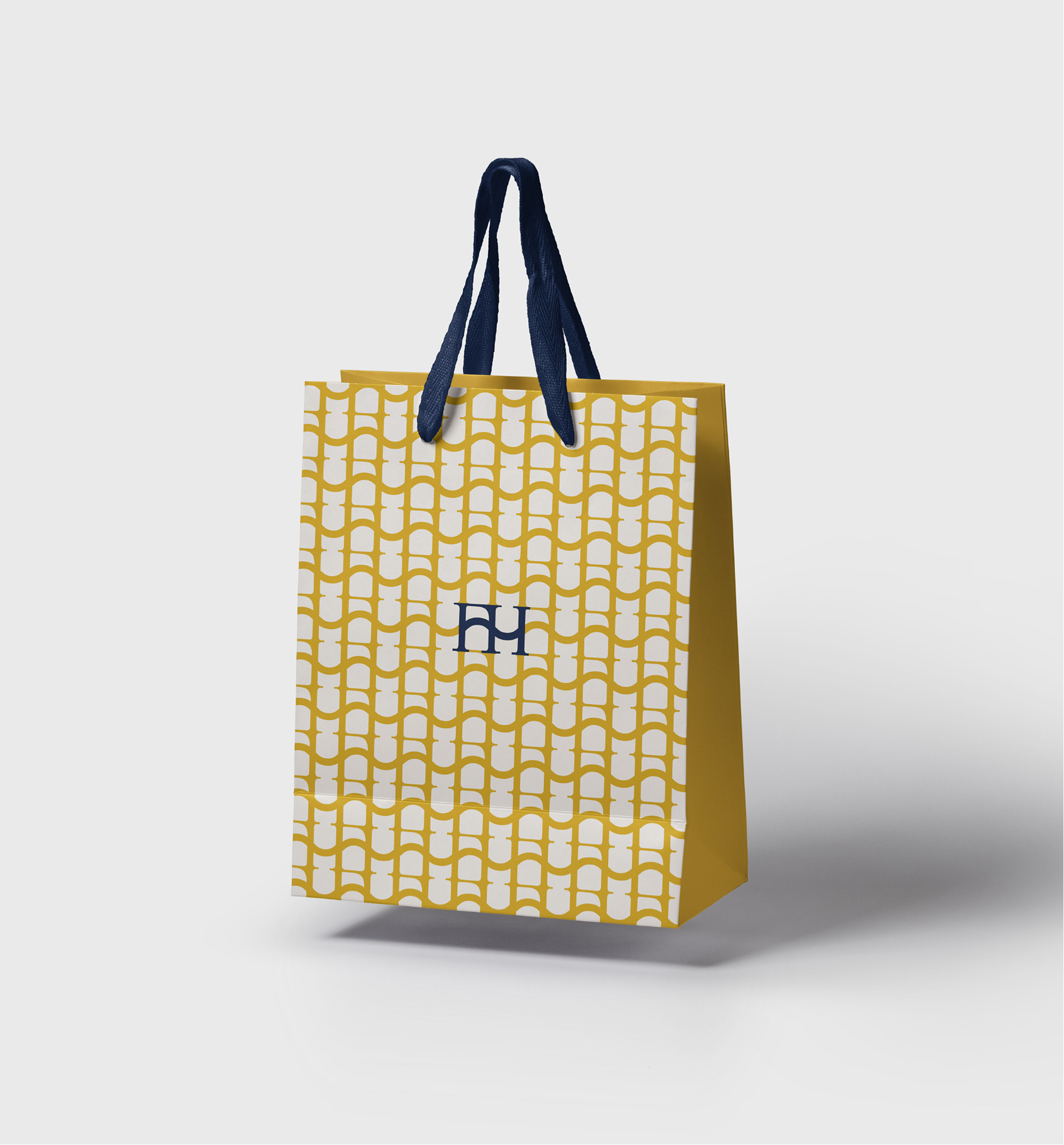
The FeelHarmony Hotel logo combines several elements:
- The letters F and H, which are the initials of the nameFeel Harmony, as well as the Floating Hotel,
- The wave connecting the two letters, which, as the main motif of the design, symbolizes the unusual location of the Hotel, as well as a sound wave, referring to the name and the nearby Philharmonic Hall,
- Three pillars representing the three architectural modules that will house the Hotel.
My role:
I was responsible for leading the project, including art direction of the interior design visuals as well as creating the logo, brand world, layouts, editorial design, print preparation of the investment brochure and overseeing the printing process.
The interior design visualizations are created by studio KOLORPLUS.
Client
FeelHarmony Floating Hotel*****
Scope
Logo Design
Branding
Visual Identity
Art Direction


